Profile table report
You can access reports concerning your profile tables through the dedicated app called 'Profiles reports' (Apps > Reporting > Profiles reports).

This app is composed out of several categories that show different graphs.
You have the possibility to export the data contained in these different graphs. You can:
- Print the chart
- Download as SVG
- Download as CSV
![]()
In the upper left corner, you will have to choose the profile table for which you want to visualise the report. Below this, you will have the opportunity to define filters based on a subscription or a segment linked to the profile table you chose.

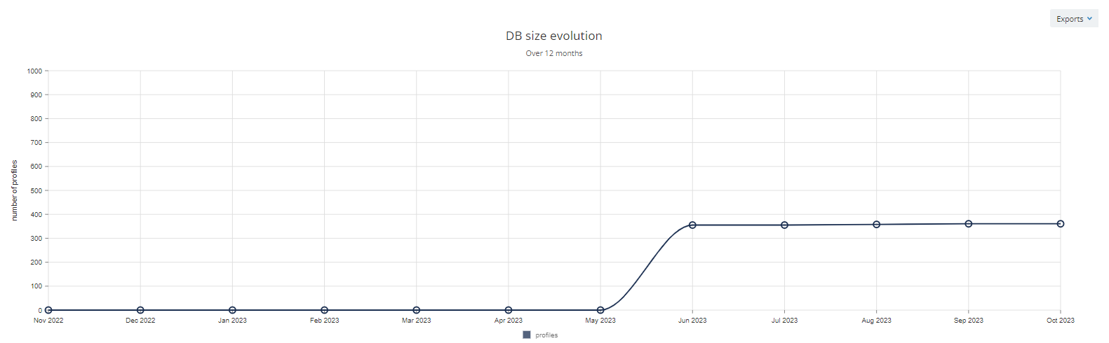
General data
The first category is about the general data of your profile table.
Evolution
This tab shows the general size evolution of your profile table over the last 12 months.
Profiles behavior
This second category is called 'Profiles behavior'.
Activation matrix
This tab shows the activation matrix available for the chosen profile table. For more information about this topic, please read the dedicated article.
Activation matrixes not available in all licences, they require to be enabled by Actito teams. For more information, please reach out to your account manager.
E-mail activity
The email activity report enables to visualize the activity of six categories of profiles on a given profile table through two different angles: the activity distribution and the evolution of the email activity of the categories. The main criteria to determine the profile's activity is the opening of email campaigns. The aim of this report is to visualize the repartition between the categories and adapt the activation strategies accordingly.
The profiles are categorized in 6 predefined categories corresponding to criteria retrieved from the profile table:
- Active profiles
- opened an email less than (or exactly) X days ago (by default: 90 days)
- Profiles at risk
- opened an email between X and X days ago (by default: between 90 and 180 days)
- Inactive profiles
- opened an email more than X days ago (by default: 180 days)
- New non-openers profiles
- profiles that were created less than X days ago (by default: 90 days)
- and that never opened an email
- Ghost profiles
- profiles that were created more than X days ago (by default: 90 days)
- that were targeted
- but that never opened an email
- Untargeted profiles
- profiles that were created more than X days ago (by default: 90 days)
- and that were never targeted by an email campaign
By default, the tresholds are defined as mentioned above. However, these can be adapted according to your business and industry for a given profile table.

However, the tresholds can only be modified by the Administrator of the licence.
Changing the tresholds is not a trivial action. When changing them, all data history is lost in order for it to be coherent with the new tresholds. Therefore, you should thoroughly think about these before changing them.
Moreover, changing the tresholds in the activity distribution change them in the evolution too, and vice versa.
Before changing the tresholds, you can export the data from the different reports in order to keep the information.
Similarly to other database reporting, you will be able to filter the results based on a subscription, a segment or a campaign type as results may vary accordingly.
As for any other report, it is possible to export the email activity reports:
- in .csv
- in .svg
- as a chart
Activity distribution
The activity distribution report reveals a pie chart showing the repartition of the different categories of profiles in absolute number and in percentage.
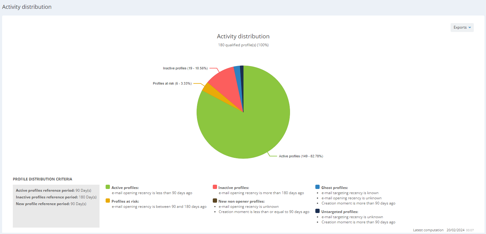
If you want to reach out to specific categories of profiles or build scenarios according to these, you can recreate them in the 'Saved targetings app'. Do not forget to think about the best deliverability practices before creating your campaigns and/or scenarios.
In the lower right corner, you will see the time and date of the latest computation. The computation happens once a day during the night.
![]()
Evolution
The evolution tab shows a graph enabling, as its name suggests, to follow the changes over time of the different profile categories. These metrics will enable to measure the impact of the campaigns that were sent (for example, if a certain campaign enabled to reactivate inactive profiles).
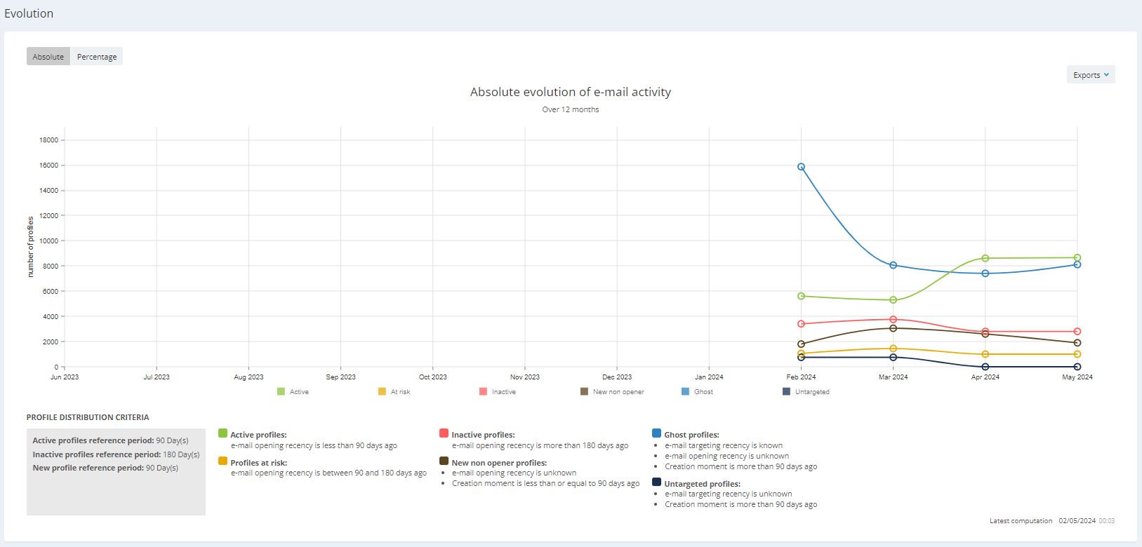
The evolution is available in absolute number and in percentage.
![]()
The evolution is shown month by month over a period of 12 months.
You have the opportunity to filter the evolution chart based on certain categories only by thicking or unthicking the category. This will enable you to concentrate on the categories that interest you.
In the lower right corner, you will see the time and date of the latest computation. The computation happens once a day during the night.
![]()
Socio-demo
The third category reports information about the gender distribution, the population distribution, the age distribution, the language distribution and the qualification of your data.
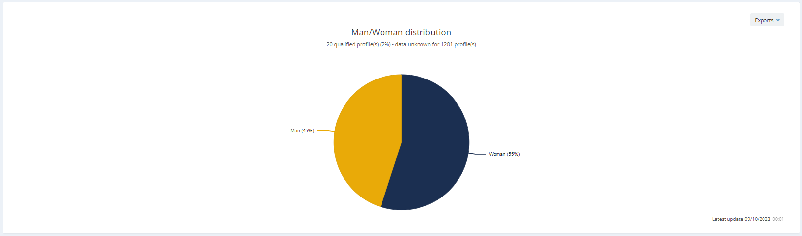
Man/woman distribution
This first tab shows a graph of the distribution of men and women in your profile table.
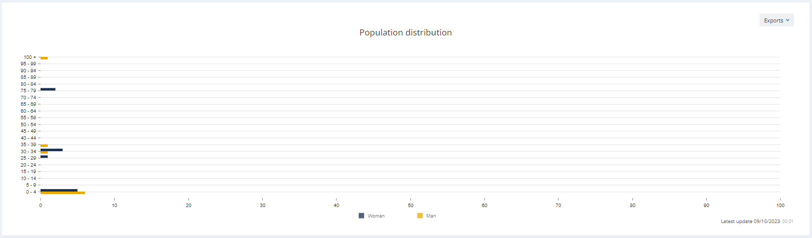
Population distribution
In the second tab, you can observe a graph showing the population distribution. On the X-axis, you can see the age of the profiles, and on the Y-axis, you see the number of profiles corresponding in function of their gender.
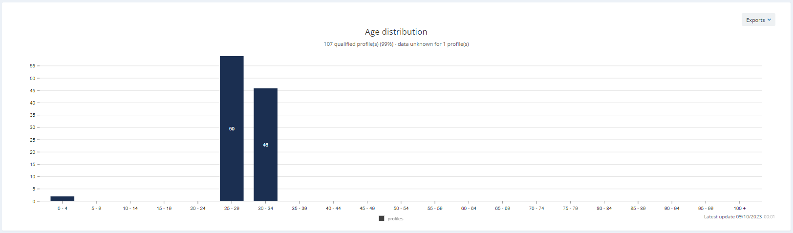
Age distribution
The third tab shows a graph of the age distribution in your profile table. On the X-axis, you can see the number of profiles and on the Y-axis, you observe the age.
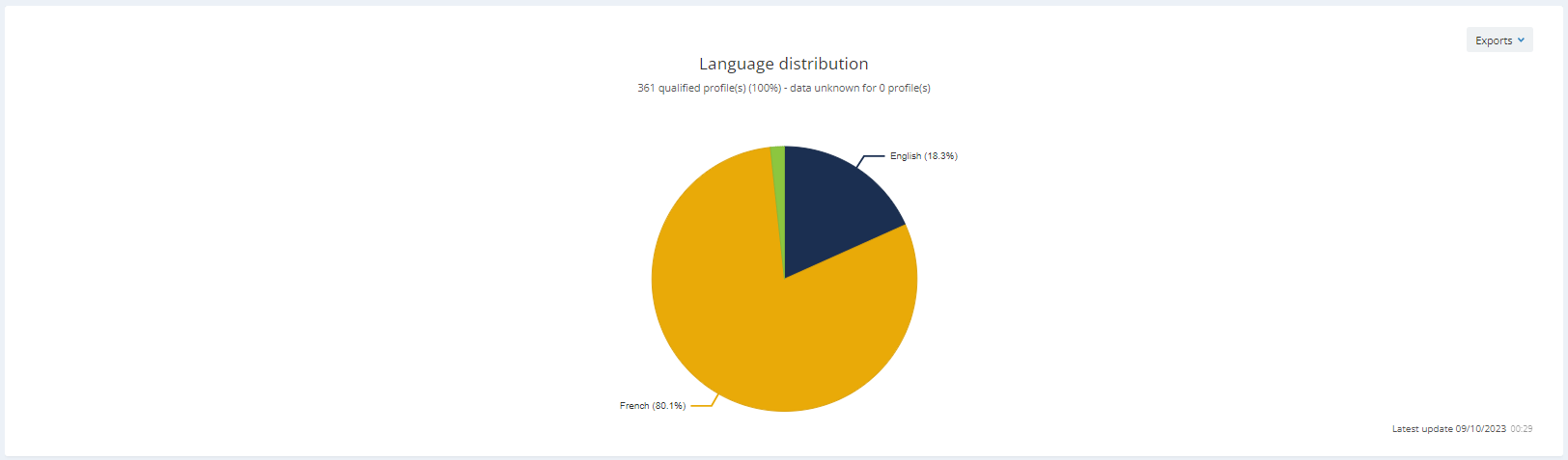
Language distribution
The tab about the language distribution shows a graph which will help you to understand which languages are spoken by the profiles in your profile table.
Qualification
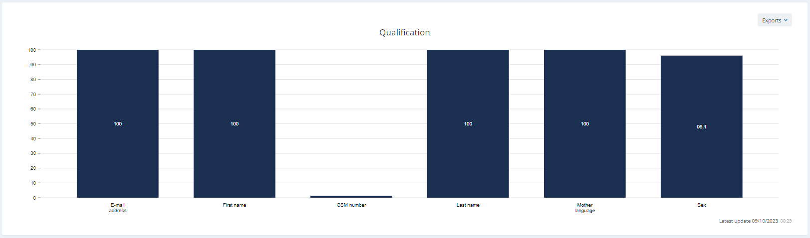
The fifth tab of this category is called 'Qualification' and shows the rate of profiles that have the information about certain attributes in your profile table.
Subscriptions
The fourth category shows a graph about the subscriptions in your profile table.
Evolution
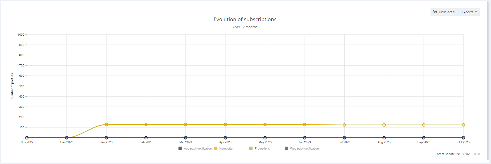
The Evolution tab shows the evolution (over the last 12 months) of the number of profiles subscribed to the subscriptions contained in your profile table. You can choose for which subscriptions you want to see the evolution. In order to save time, you can unselect them all (in the right upper corner) and choose only a few of them.
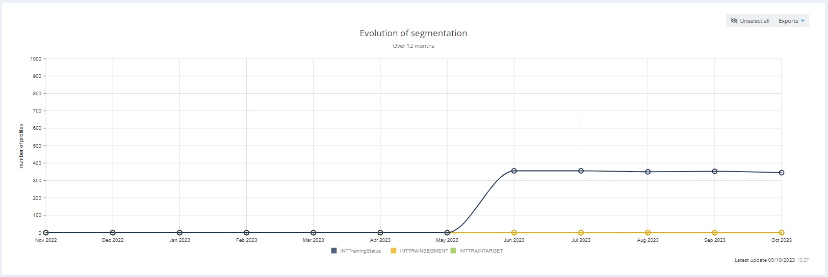
Segmentations
This fifth category tackles the subject of segmentations in your profile table.
Evolution
In this tab, you will observe the evolution of the segmentations over the last 12 months. Here again, you can unselect them all (in the right upper corner) and choose only a few of them.