Generic
The Generic pass is the most versatile pass type available in Apple Wallet and Google Wallet. It is designed for use cases that do not fit into a dedicated category — membership cards, gift cards, coupons, access badges, vouchers, and any other type of pass that requires a flexible, custom layout.
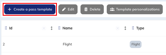
To create a new Generic pass template, go to the "Pass templates" module (Hub > Wallet > Pass templates).

Click on the Create a pass template button.
Once your template is created, you will need to define template personalizations from the Manage pass templates module.
One template must be created per use case. If you issue passes for different programmes or card types, create one template per type.
Step 1 - Setup
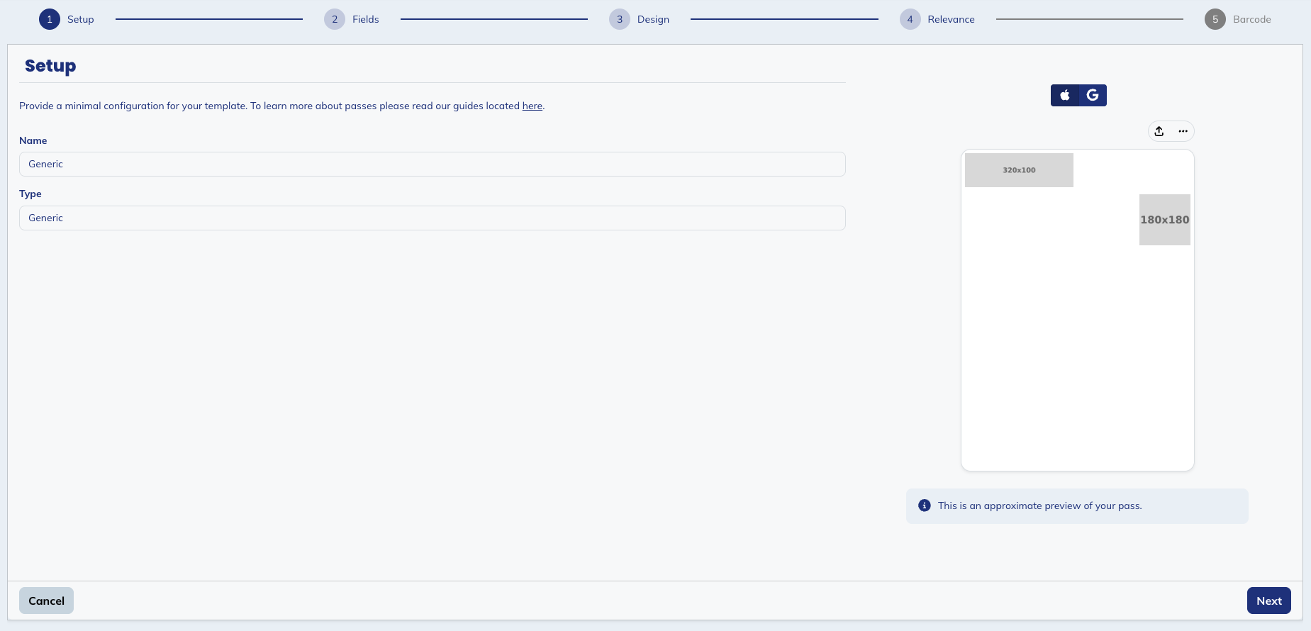
This first step enables you to define the basic information of your template:
- Name: the internal name of your template. This is only visible to you and your team in your licence. We recommend using a clear naming convention.
- Type: the type of your pass template. This determines the visual layout and available fields for this template.
Your template name is what appears in your pass list and reporting. If you plan to issue passes for multiple programmes or card types, include that context in the name from the start.
Step 2 - Fields
Fields are the data that populate your passes. Every field you want to display or use, whether fixed or personalised, must be defined here first.
There are two types of fields:
- Common fields: the value is fixed and identical for all passes generated from this template. It cannot be changed at pass creation. Use these for data that is the same for every pass holder: your organisation name, your brand colours.
- Pass fields: the value can be overridden at pass creation. The value defined here is the default, used if no other value is provided. Use these for data that varies per pass holder: card holder name, member ID, account balance.
You will have to add all fields you will be using in your pass template. These fields may then be included in your passes and ultimately define what data is displayed to users. In step 3, you will define where these fields will be displayed on the pass.
The fields that need to be personalised based on profile attributes will need to be configured in the template personalizations.
You may notice that some fields appear in both Common fields and Pass fields — for example, backgroundColor. This is intentional: Apple Wallet allows certain properties to be personalised at the individual pass level, meaning each issued pass can have its own value. Google Wallet, however, does not support this level of personalisation for those same properties and requires a single value shared across all passes. If you are issuing passes for both platforms, defining the field in both sections ensures maximum flexibility.
Common fields
Common fields define the data shared across all passes generated from this template.
Common fields are shared across all passes generated from this template. Their values can only be edited by updating the template directly. Note that changes to common fields will only apply to newly created passes. Existing passes can only be updated through an update campaign.
| Key | Type | Description |
|---|---|---|
issuerName | String | The name of the organisation issuing the pass (e.g. My Company). Displayed on the pass and used by screen readers. |
hexBackgroundColor | Color | The background colour of the Google Wallet pass, defined as a hex colour code (e.g. #FFFFFF). |
Pass fields
Pass fields control the visual appearance of the pass and the personalised data displayed for each individual pass holder.
Unlike common fields, these fields are reserved for any properties that contain unique details of a specific pass issued to a specific user. These fields may be changed whenever you create or update a specific pass.
| Key | Type | Description |
|---|---|---|
backgroundColor | Color | The background colour of the Apple Wallet pass in hexadecimal format (e.g. #FFFFFF). |
foregroundColor | Color | The colour of the primary text on the Apple Wallet pass (e.g. #000000). Ensure sufficient contrast with the background colour for legibility. |
labelColor | Color | The colour of the field labels on the Apple Wallet pass (e.g. #000000). Labels are the small captions displayed above each value. |
icon | Image | The app icon displayed in the pass list and system notifications. Size: 29×29 pt (@2x: 58×58 px). PNG with transparent background. |
logo | Image | Your logo displayed in the top-left corner of the pass. Size: 160×50 pt (@2x: 320×100 px). Transparent background is mandatory. |
thumbnail | Image | A square image displayed on the right side of the Apple Wallet pass. Size: 90×90 pt (@2x: 180×180 px). |
genericLogo | Image | The logo displayed on the Google Wallet pass. Recommended size: 256×256 px. |
genericWideLogo | Image | A wide logo displayed on the Google Wallet pass, used as an alternative to the standard logo. Recommended size: 1032×336 px. |
heroImage | Image | A full-width banner image displayed on the Google Wallet pass. Recommended size: 1032×336 px. |
cardTitle | String | The title of the card, displayed prominently on the Google Wallet pass. |
header | String | The header text displayed on the Google Wallet pass. |
cardTitle, header, and any other pass-level data are the fields you will typically inject dynamically at pass issuance, as they vary per pass holder.
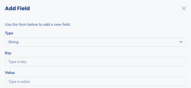
Add and delete fields
You have the possibility to delete fields by ticking the box on the left side of the field and then clicking on Delete fields.
You also have the possibility to add fields if some are missing. Click on Add field.
For the added field, you will need to choose:
- the type: string, blob, date, number, money, color, image, JSON or boolean
- the key: the technical name of the field
- the value: the default value of the field
Step 3 - Design
Once all the fields you want to use in your template are added in the second step, you will have the possibility to define how your pass will be rendered on each platform. This step is split into two tabs, one for Apple Wallet and another for Google Wallet.
- Apple Wallet
- Google Wallet
Apple Wallet
The Apple Wallet tab is divided into four sub-tabs: General, Design, Data, and Semantics.
The Generic template looks like this:
General
In this tab, you can customize the basic information of your pass. For each field:
- You can choose common fields or pass fields you will have defined in the previous step. Only fields having the expected format will be available.
- You can add new field, if you forgot to add a field in the previous step, you can add it here and it will automatically be added to the list of fields from step 2.
- You can decide to use another value, a static value, that you are not planning on reusing in other fields.
In the following table, you'll find the fields and their description.
| Field | Description |
|---|---|
| Organisation name | The name displayed on the pass. Typically your brand or organisation name. Map this to your issuerName field. |
| Description | A short text description used by accessibility tools and device search. |
| App Store Identifiers | Links your pass to an app in the App Store. A banner prompting the user to install your app appears on the back of the pass. |
| App's launch URL | A URL that opens your app directly when tapped from the pass. Requires an App Store Identifier. |
| User info | A metadata field for passing custom, non-displayed data alongside the pass. Useful for internal tracking or CRM linking. |
| Prevent pass sharing | When enabled, prevents the user from forwarding the pass to others. |
Design
The Design sub-tab maps directly to the Pass Fields defined in the second step. Select the corresponding field for each visual element using the dropdown.
For the Generic pass, the available visual elements are: Logo text, Icon (29×29 pt, @2x: 58×58 px), Logo (160×50 pt, @2x: 320×100 px), Thumbnail (90×90 pt, @2x: 180×180 px), Background color, Foreground color, and Label color.
On the right side of your screen, you have a preview of what your pass template looks like.
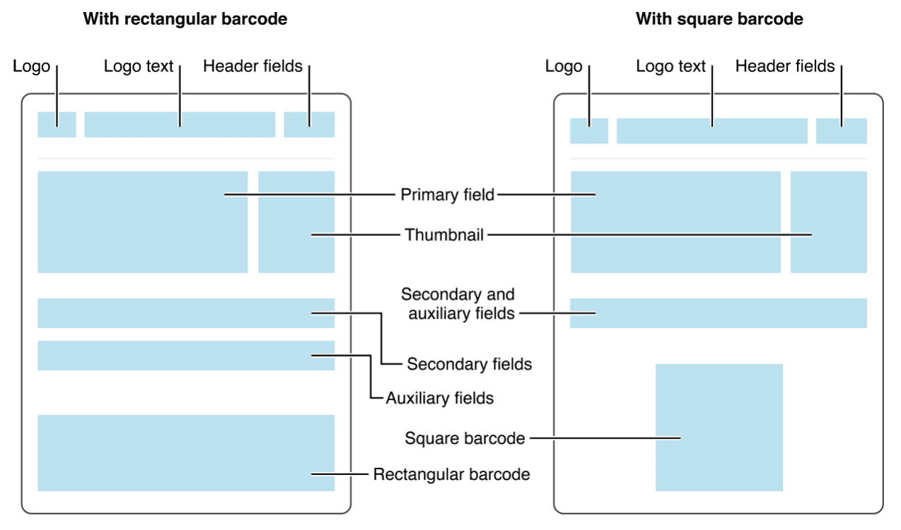
Data
The Data sub-tab lets you assign your fields to the visual zones of the pass (Header, Primary, Secondary, Auxiliary and Back). Use the Label, Key, and Value columns to control what is displayed in each zone and in what order.
For each zone of the pass:
-
You can add a field, where you will have to define different fields. Note that here, you define the design of the pass. Therefore, you will define the labels you want to show, and the value that should be displayed. These two are not necessarily from the same field you have defined in step 2.

- Key: the unique key for the combination of label and value
- Label: the label of the field, which is the part above
- Value: the value of the field, which is the part below
- Alignment: the alignment of the field
-
You can delete a field from that zone of the pass, by ticking the box on the left side of the field and clicking on Delete field.
-
You can edit a field by clicking on it.
The order of fields within each zone controls their left-to-right display order on the pass. Use the live preview on the right to check the layout as you configure it.
The available zones for the Generic pass are:
| Zone | Description |
|---|---|
| Header fields | Displayed at the very top of the pass, next to the logo. Visible in the pass list without opening the pass. Use for the most critical identifier (e.g. card type, member tier). |
| Primary fields | The most prominent field on the pass front. Use for the most important piece of information (e.g. card holder name, member ID). |
| Secondary fields | Displayed below the primary field. Use for supporting information (e.g. expiry date, account balance). |
| Auxiliary fields | Displayed below the secondary fields. Use for additional details. |
| Back fields | Displayed on the back of the pass (when the user taps the ⓘ button). Use for terms and conditions, contact details, or any information that does not need to be immediately visible. |
Semantics
Semantics are machine-readable metadata that Apple uses to power system-wide features such as Siri Suggestions, Spotlight Search, and proactive lock screen display. They are not visible on the pass itself — they work silently in the background to make your pass smarter.
For Generic passes, semantics are organised into two categories:
Pricing
| Field | Description |
|---|---|
| Currency code | The ISO 4217 currency code for the pass value (e.g. EUR, USD). |
| Amount | The monetary amount associated with the pass (e.g. a gift card balance or voucher value). |
Other
| Field | Description |
|---|---|
| Wi-Fi Access | One or more Wi-Fi networks that can be joined automatically when the pass is relevant. Add a network by clicking Add Network and providing the SSID and password. |
Filling in semantics is optional but recommended — it allows iOS to surface your pass contextually without any additional effort from you.
For each semantic:
- You can choose common fields or pass fields you will have defined in the previous step. Only fields having the expected format will be available.
- You can add new field, if you forgot to add a field in the previous step, you can add it here and it will automatically be added to the list of fields from step 2.
- You can decide to use another value, a static value, that you are not planning on reusing in other fields.
Google Wallet
The Google Wallet tab is divided into four sub-tabs: General, Design, Common Data, and Pass Data.
General
In this tab, you can customize the basic information of your pass. For each field:
- You can choose common fields or pass fields you will have defined in the previous step. Only fields having the expected format will be available.
- You can add new field, if you forgot to add a field in the previous step, you can add it here and it will automatically be added to the list of fields from step 2.
- You can decide to use another value, a static value, that you are not planning on reusing in other fields.
In the following table, you'll find the fields and their description.
| Field | Description |
|---|---|
| Enable smart tap | Activates NFC-based contactless interactions for terminals that support Google Smart Tap. |
| Security Animation | An animated security pattern displayed on the pass to prevent counterfeiting. |
| Unlock Requirement | Defines whether the device must be unlocked to display the pass. |
| Multiple devices and holders allowed | Controls whether the pass can be saved by multiple users. Defaults to Multiple Users. |
| Homepage URL | A URL displayed on the pass linking to your website or programme page. |
| Screenshot Eligibility | Controls whether the pass can be screenshotted on the device. |
| NFC Constraint | Defines additional restrictions on NFC interaction behaviour. |
Design
The Design sub-tab maps directly to the Pass Fields defined in Step 2. For Google Wallet, two visual elements are configurable: the Hero image (516×168 pt, uploaded at @2x: 1032×336 px) and the Background color. Select the corresponding Pass Field for each using the dropdown.
Common Data
The Common Data sub-tab maps your Common Fields to Google Wallet's structured data model. Select the corresponding Common Field for each slot using the dropdown.
For each field:
- You can choose common fields you will have defined in the previous step. Only fields having the expected format will be available.
- You can add new field, if you forgot to add a field in the previous step, you can add it here and it will automatically be added to the list of fields from step 2.
- You can decide to use another value, a static value, that you are not planning on reusing in other fields.
Generic Data
| Field | Description |
|---|---|
| Issuer Name | The name of the organisation issuing the pass. |
Pass Data
The Pass Data sub-tab maps your Pass Fields to the data displayed on each individual Google Wallet pass.
For each field:
- You can choose pass fields you will have defined in the previous step. Only fields having the expected format will be available.
- You can add new field, if you forgot to add a field in the previous step, you can add it here and it will automatically be added to the list of fields from step 2.
- You can decide to use another value, a static value, that you are not planning on reusing in other fields.
Generic Card Data
| Field | Recommended size | Description |
|---|---|---|
| Card Title | — | The title displayed prominently on the Google Wallet pass. Maps to cardTitle. |
| Logo | 256×256 px | A square logo displayed on the pass. Maps to genericLogo. |
| Wide Logo | 1032×336 px | A wide logo displayed on the pass, used as an alternative to the standard logo. Maps to genericWideLogo. |
| Header | — | The header text displayed on the pass. Maps to header. |
| Subheader | — | A secondary text displayed below the header. |
Notifications
| Field | Description |
|---|---|
| Notification Type | Defines the type of notification sent to the user when the pass is updated. |
App Links
Use this section to provide information about a companion app. You can configure links for Android, iOS, and Web separately.
| Field | Description |
|---|---|
| App logo image | The logo of the companion app, displayed alongside the app link. |
| App URL | The URL or deep link to the companion app. |
| Title | The title of the app link. |
| Description | A short description displayed with the app link. |
Other
Use this section to enrich the back of the Google Wallet pass with additional content.
| Field | Description |
|---|---|
| Messages | Contextual messages displayed to the pass holder. Click Add Message to add one. |
| Images | Additional images displayed on the pass. Click Add Image to add one. |
| Info Texts | Informational text blocks (e.g. terms and conditions). Click Add Info Text to add one. |
| Links | External links displayed on the pass (e.g. your website or programme page). Click Add Link to add one. |
Always preview both the Apple Wallet and Google Wallet versions of your pass before publishing. The live preview on the right side of the screen updates in real time as you configure your design.
Step 4 - Relevance
Relevance defines when and where your pass surfaces automatically on the user's lock screen, without requiring a notification to be manually triggered.
Locations
Add GPS coordinates to trigger the pass on the lock screen when the user enters a defined radius around a location. For Generic passes, the most relevant use cases are:
- Your store or venue locations
- Points of service or redemption points
Click Add Location to add a new location. You can add multiple locations per template.
Apple and Google Wallet allow up to 10 locations per pass.
Beacons (Apple Wallet only)
BTLE beacons allow ultra-precise, indoor triggering that GPS cannot achieve. If your venues have deployed Bluetooth beacons, you can configure the pass to surface automatically when the user's device detects a specific beacon.
Configure each beacon with its UUID, and optionally its Major and Minor values for more granular targeting.
Beacon-based relevance requires physical beacon hardware to be deployed on-site. Coordinate with the venue operator before configuring this option.
Step 5 - Barcode
The barcode is the scannable element that connects your digital pass to your physical redemption or access infrastructure.
| Format | Description | Recommendation |
|---|---|---|
| None | No barcode displayed on the pass. | Only if your validation is NFC-based exclusively. |
| QR Code | 2D matrix barcode. High data capacity, fast scanning, widely supported. | Recommended for most use cases. |
| PDF417 | 2D stacked barcode. | Use if your validation system requires PDF417 specifically. |
| 1D (Code 128) | Linear barcode. Low data capacity. | Suitable for simple implementations with short codes. |
| Aztec | 2D matrix barcode. Compact and efficient, native to Apple Wallet. | Suitable if your scanning infrastructure supports it. |
QR Code is the most universally supported format. If your existing validation infrastructure uses a specific barcode format, match it here to ensure compatibility with your scanners.