Using the library of modules
Not finding the proper module layout in a template from the standard library ?
In addition to the default selection of modules, Actito gives you access to an extended library of modules !
This allows you to add a wide range of designs to your campaigns.
Reaching the library of modules
The library of modules is available on every default template, as well as any custom template (designed by Actito teams) with a width of 640 pixels.
To enter the library, click on the "+" icon at the top left of the template editor.
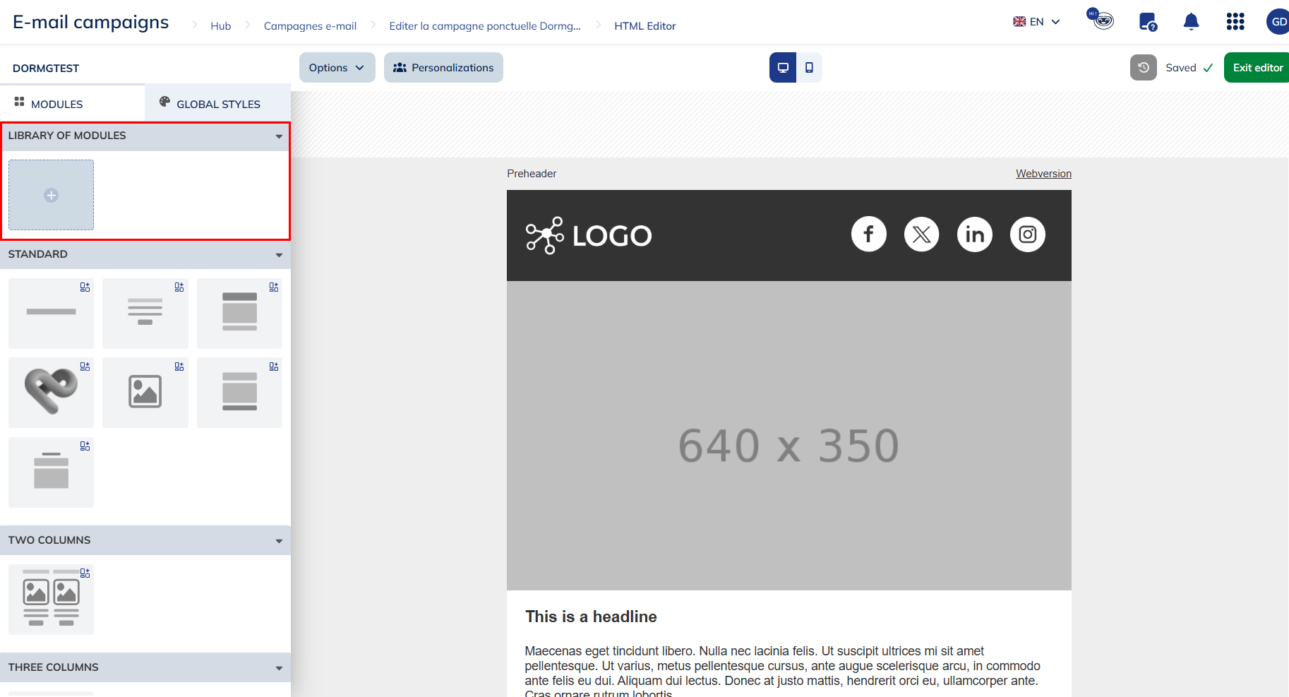
The Actito Library
The module library is divided into categories that group together modules sharing a similar layout or purpose.
- One to four columns : the four first categories will help you design most of the main content of your email. Their modules contains a combination of images, titles, texts, CTA buttons,... with the content space divided in to one, two, three or four columns. 2 columns modules all include their mirror (e.g. : image to the left, or to the right)
- Standard : This category offers variations of the common modules found in all templates : headers, footer, dividers, ...
- RSS : This category give you the possibility to use modules filled in by RSS feeds without having to use the "RSS newsletter" standard template. They allow you to paste the URL of an RSS feed and automatically retrieve the items from this feed. They are identified with the RSS symbol
.
- Loop : These modules allow you to use loop personalizations without having to edit the HTML code. Loops allow you to personalize your emails with several lines of data, which is very useful for order confirmations or abandoned cart reminders, for example. They are identified with the loop symbol
.
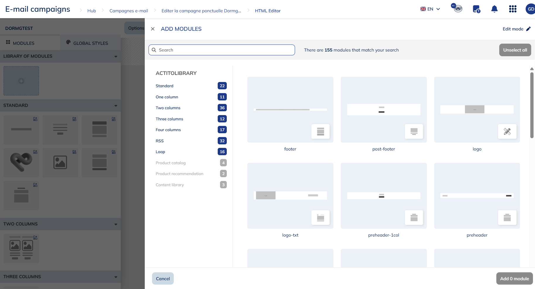
In addition to the default modules available in the Actito library, it is possible to request an adaptation of an existing module or even the creation of a module specific to your needs.
To order a custom module or for more information about the terms and conditions, please contact your account manager.
Adding a module
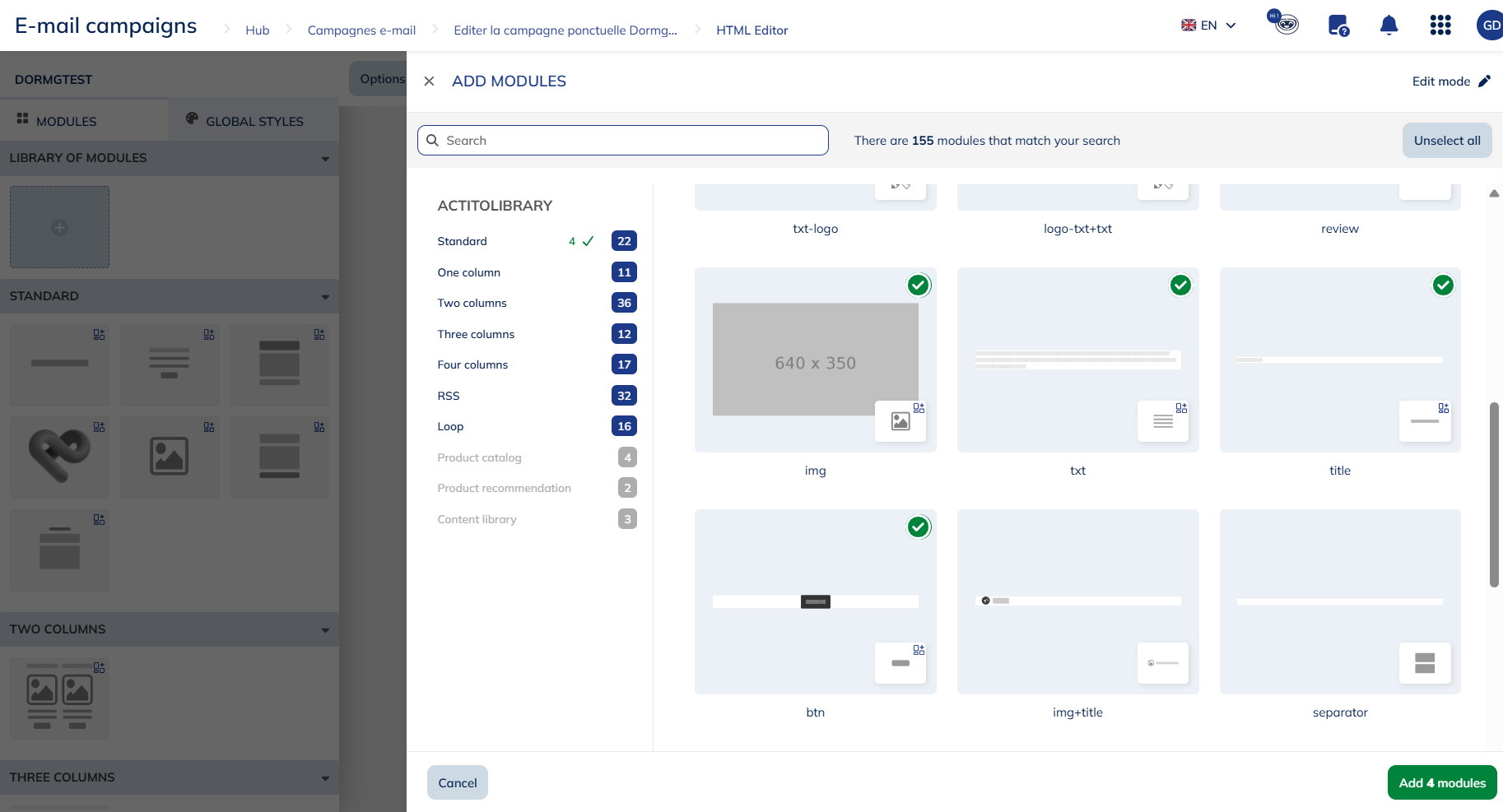
To add a module to your email, go to the relevant category, select the module(s) of your choice, and simply click "Add".
The chosen modules will be available in your template, under the "Library of modules" category.
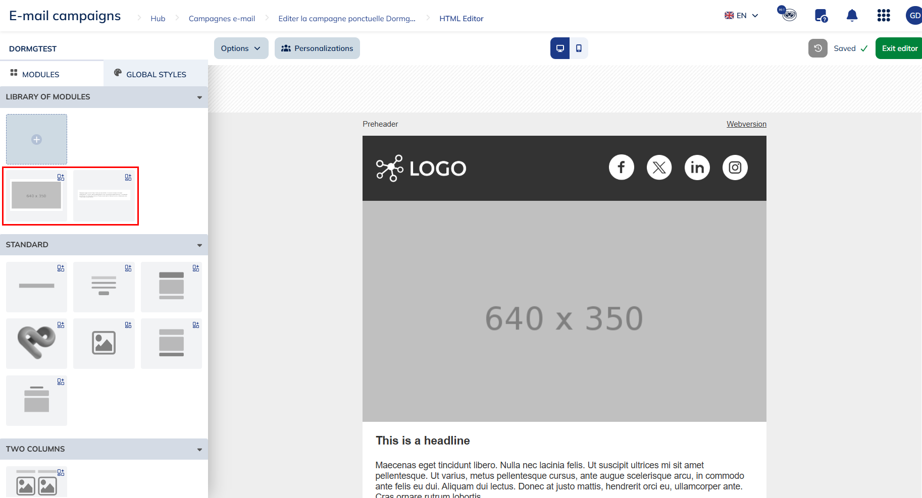
modules will remain in the module selection to the left of the editor (including in campaign templates) as long as they are used in the email content.
Non-used modules are not kept in the selection upon exiting the template editor or the email.
Editing the structure of a dynamic module
The ability to edit the structure of dynamic modules gives marketers greater autonomy and flexibility in the creation of their email campaign designs. Indeed, by editing the structure of your module, you have greater control over the appearance and organization of the content of your message.
From the email editor, you can edit the structure of 1-column modules and the following standard modules:
- Txt
- Img
- Btn
- Title
- Social
- Footer
- ...
Other modules in the library will gradually benefit from this functionality.
To do so, select on of these modules from the library of modules and had it to your email. Once the module has been inserted, you can edit its structure.
You can easily recognize them by the little blue pictogram on the preview:
To do this, hover over the module in question and click on "Edit structure". A side menu will open allowing you to add new elements to your module, reorganize them, delete them, etc.
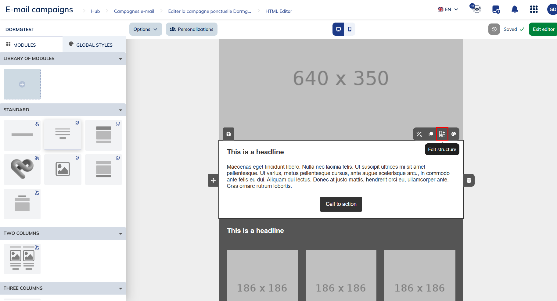
To insert an element into your module, the principle is the same as for inserting modules: simply select it by holding down the mouse button, then drag and drop it where you wish to insert it.
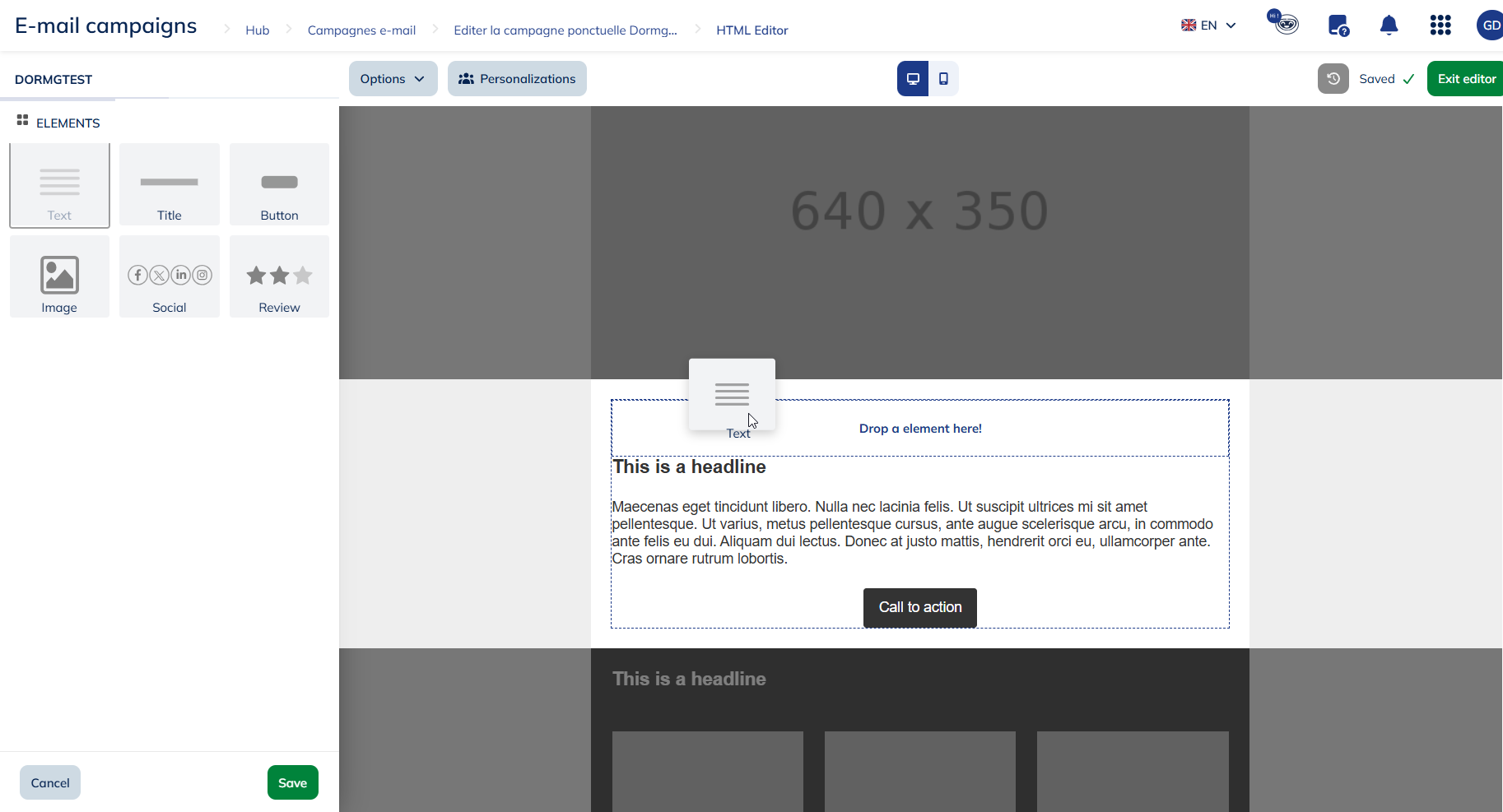
There are different types of elements that you can add to your module:
- Text zone
- Title
- Call to action buttons
- Images
- Social (links to social media)
- Review
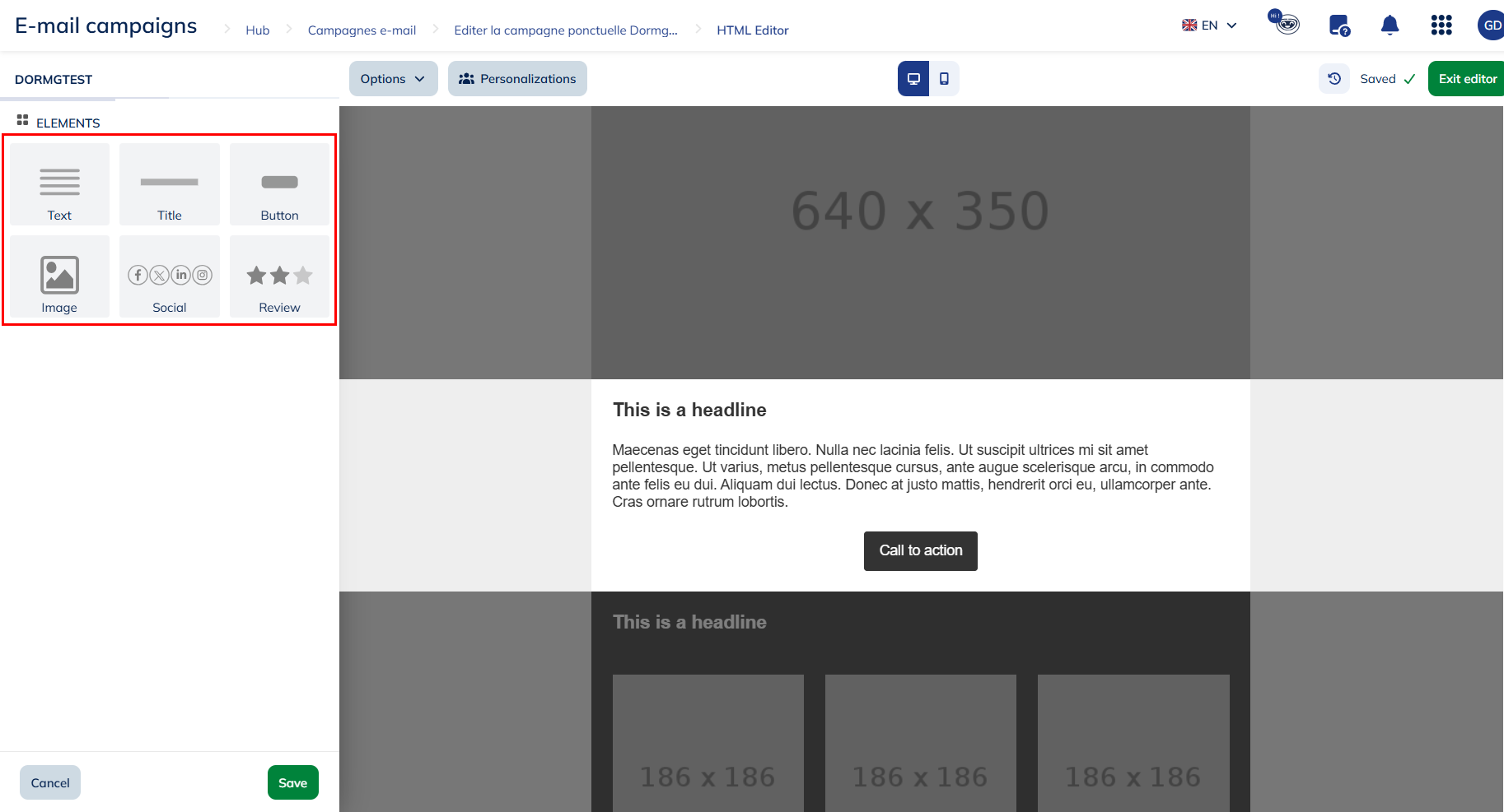
Changes applied to your module will not be automatically saved. Do not forget to save your changes before quitting the editing menu and go back to the editor.
You can also:
- Reorganize elements inside of the module
- Duplicate elements
- Delete elements
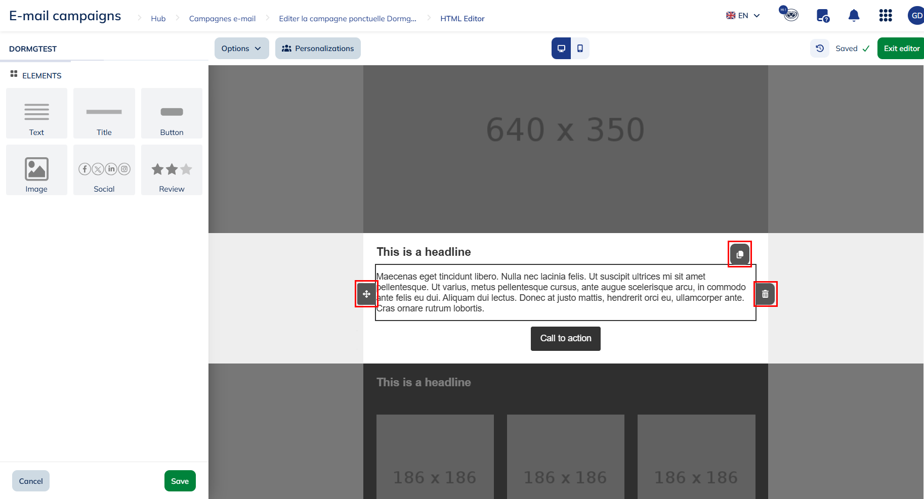
As long as you are in the "Edit structure" menu, you will not be able to modify the style/content of your elements. To do so, you will have to quit the editing menu and go back to the editor.
Once the structure of your module is finalized, you can edit the style of the elements inside your module.
If you change the style of a dynamic module, the changes will be applied to all the elements in the module. Therefore, if you want to display a different style for each of your elements, spread your elements over different modules.
Saving your own module library
In addition to the standard categories, Actito also gives you the opportunity to save your own modules in the library, so you can fill in existing modules with your logo, your corporate colors, etc, and reuse them !
This is also very useful to transfer a module designed in a campaign to another email, in order to save it in a campaign template, for example.
To save your own module, click on the "save" icon at the top left corner of the module.

Saving a module in the library is an advanced feature and is tied to a specific user right. If you need access to this feature, please contact your Admin User or your account manager.
If you didn't create your own specific library, the module will be saved in an auto-generated library.

As module cannot be moved once they're saved, we advise you to set up your library beforehand.
If you have already set up your own libraries, you will be able to choose in which library and in which category the module will be saved.
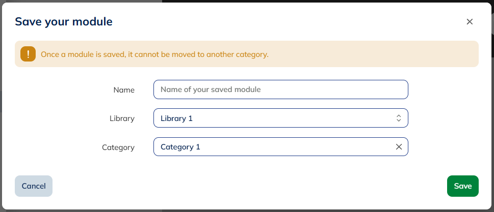
When you save a dynamic module in your library, its thumbnail will be a representation of that module, so you can easily identify it.
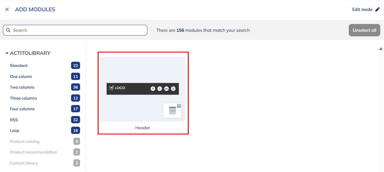
Editing your module library
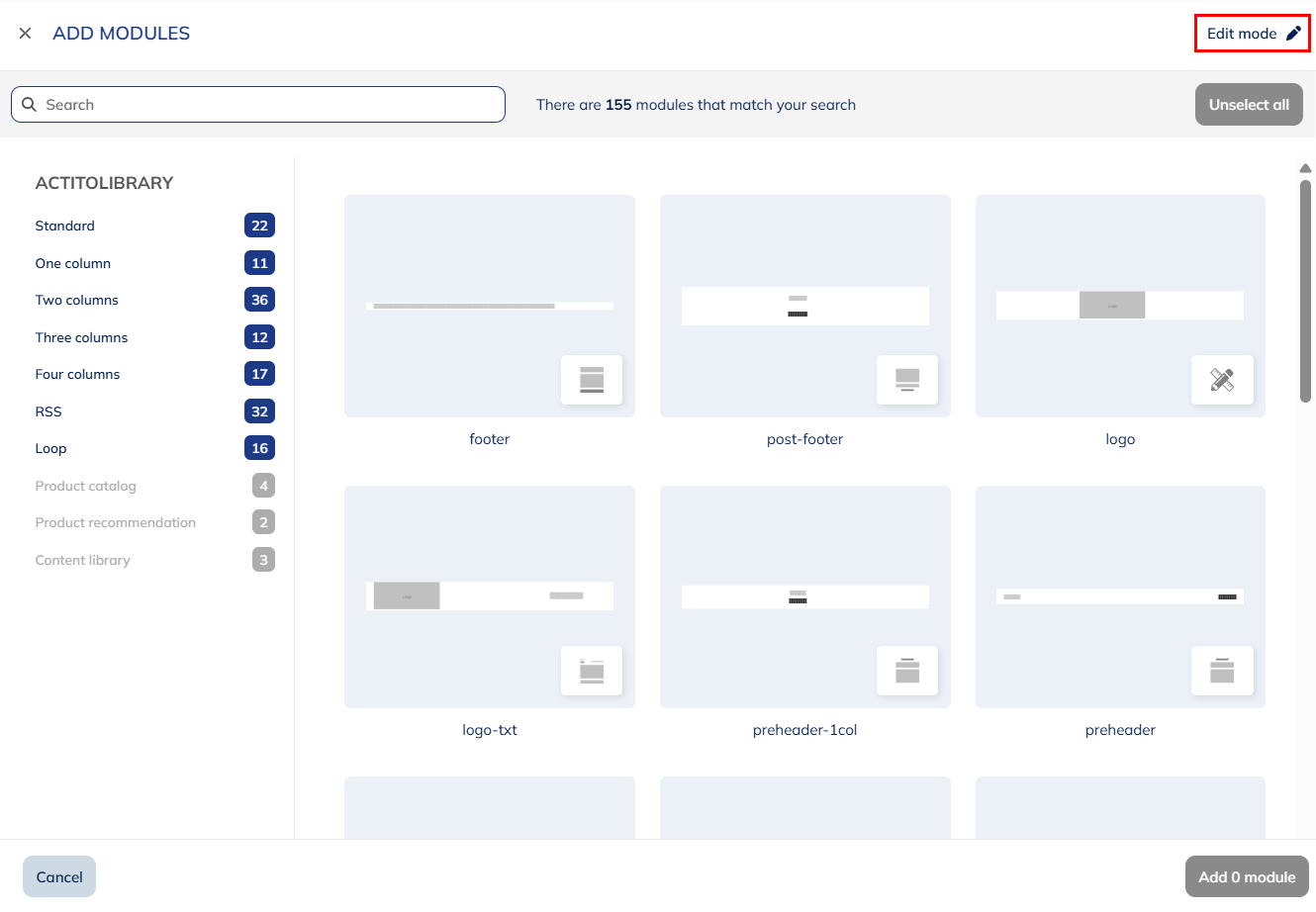
To manage your own module library, go to the standard library and enter "Edit mode" in the top right corner.
Adding a library
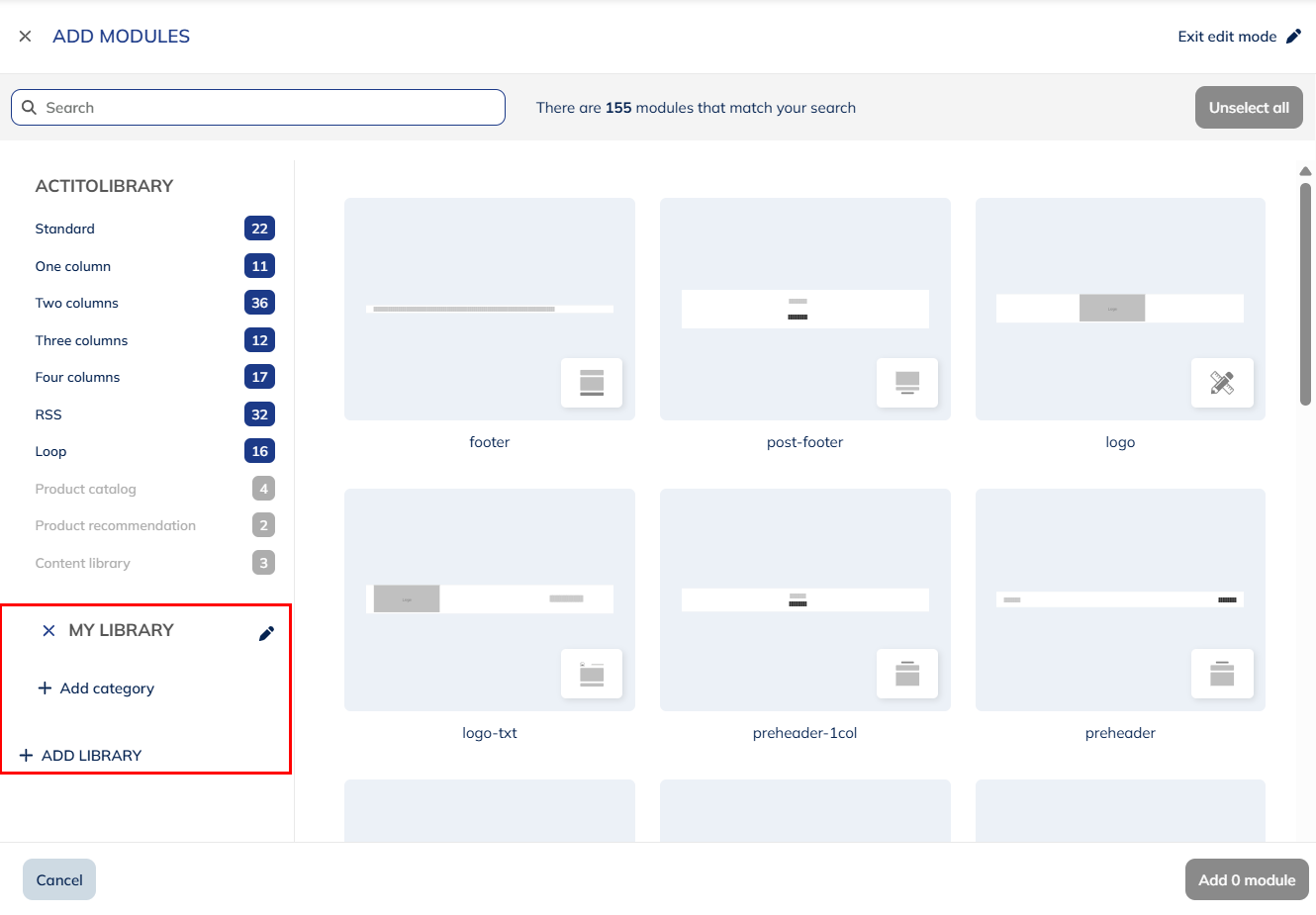
From edit mode, you can add a new library. We advise you to do so if you want to save you own module, as you cannot add them to the common Actito library.
When you "Add a library", a new Library 1 (and so on) will be automatically created. You will be able to rename your library by clicking on it in edit mode.
You can have several libraries, which is useful if you manage more than one brand, for instance.
Your custom libraries are tied to the entity of the email campaign from which it was created.
Adding a category
Like the common library, you can organize your own library in several categories to group your modules together.
Click on a "Add category" to create a new Category 1 (and so on), which can be renamed.
Deleting elements from the library
In edit mode, you can delete one of your own module by selecting the "cross" icon in the top right corner, then confirming the deletion.
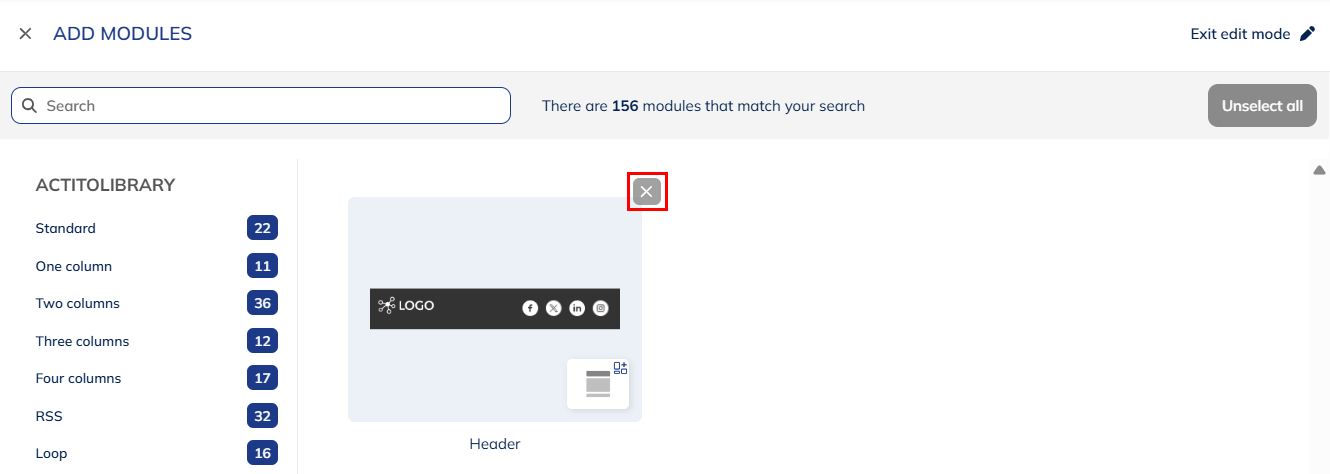
You cannot delete modules from the common Actito library.
You can also delete categories with the "cross" icon to the left of their name, as long as they do not contain any module anymore. You should therefore delete the modules first.
Likewise, to delete a library, it cannot contain any category anymore.