Styles
Design plays a key role in how your audience perceives your campaigns. To help you stay on brand and create engaging emails, Actito editor lets you easily customize the styles of your modules, buttons, and even the global design of the template.
From adjusting colors and padding, to editing borders and refining "Call to action" buttons, you can shape every detail directly in the editor (without any code). And if you prefer consistency, global style settings let you apply changes across your entire email in just a few clicks.
Some options presented below, such as button styles, are available by default in standard templates and blocks of the module library that contain CTA buttons.
If you are interested by these features in your custom template, we invite you to contact your account manager.
The editor allows you to personalize your email on three levels:
-
Global styles: allow you to define the overall appearance of the email. The options defined here apply by default to the entire template.
-
Standard modules styles: allow you to define the style of a particular module without these changes applying to the entire template.
-
Dynamic modules styles: like for standard modules, these allow you to define the style of a particular module. However, these modules offer additional options such as conditional visibility on more elements (desktop/mobile), hover effects, style variations depending on content, etc.
Editing global styles
The "Global Styles" tab allows you to define the overall design settings that apply to all blocks in your email, ensuring a consistent look and feel across your campaign.

By default, all modules will take the value defined in the global styles, but you can still customize specific blocks individually to adapt their appearance as needed. In this case the box "Use the global value of the template" will be unchecked automatically. You only need to check it again to restore the original value (or the options defined in the Global styles tab).
For most settings, you can apply different style settings depending on whether your email is for the web or mobile version.
Template colors
This allows you to save colors and use them in the email. This is handy if your organization uses some specific color shades in its graphical charter (no need to remember the RGB code).By defining the template colors, these colors will be available in each color picker of the email.

Module styles
This allows you to define the colors (row background and block content), the paddings and borders uniformly or specifically for each edge.
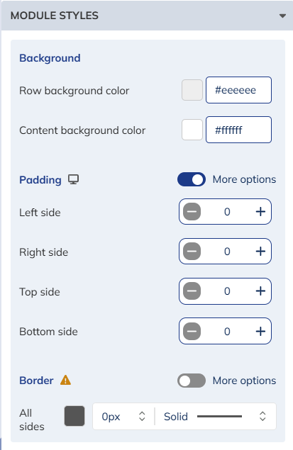
The colors defined here, are applied to the whole email, so the row background color is the row background for all the modules.
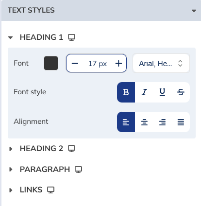
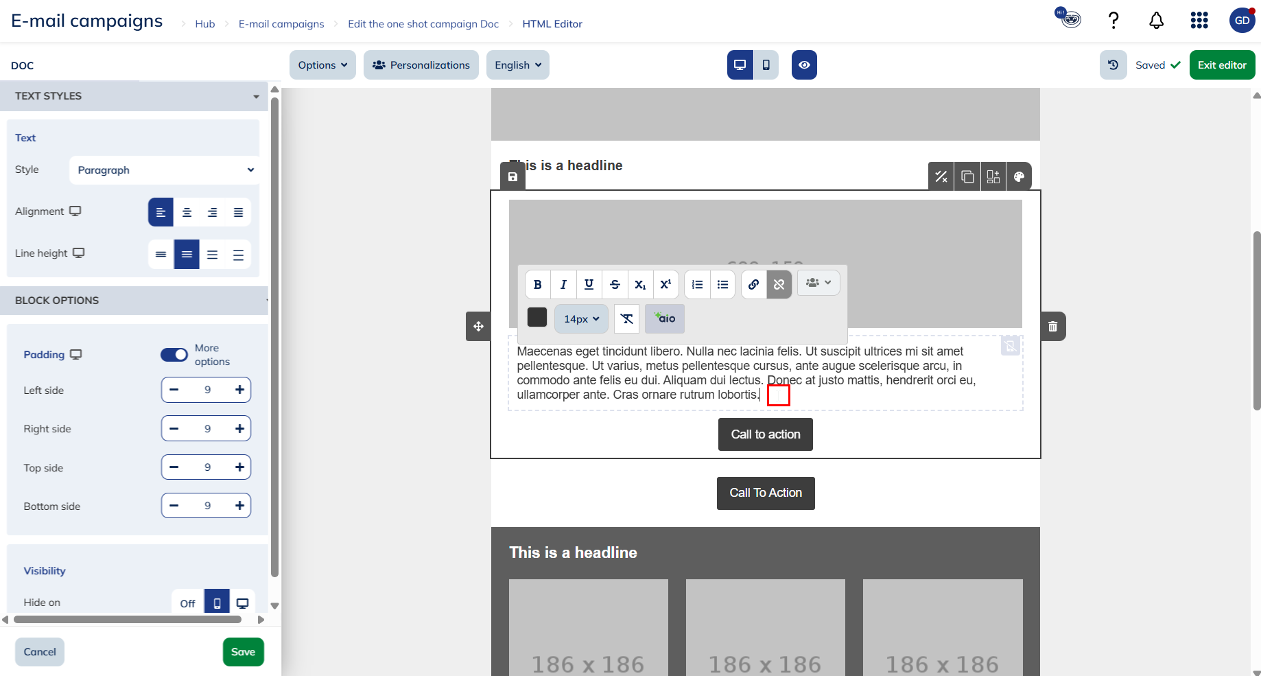
Text styles
You can also define the text styles that will be used for the whole template. By default, there are three title styles, one paragraph style and one style for links.
For each style, you can choose:
- the text color
- the size in pixels
- the text font, from an extended list of preselected fonts compatible with the different email servers. If you are using a custom template, there might be other fonts available.
- the font style (bold, italic, underlined, strikethrough)
- the alignment (left, center, right, or justified)
The names of the different styles are just a suggestion about how to use them. If, for example, you need to use two different fonts for your paragraph text, you are free to use the "Heading 3" style in the body of a message.
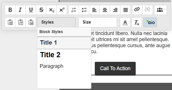
You can modify the style of a text fragment directly in the template, or you can also select a different style.
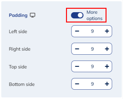
Button styles
This allows you to modify the style of all the "call to action" buttons of your email at once.

You will able to define:
- background color
- text style
- borders options (if you add one)
In every block that contains "call to action" buttons, you can also customize their appearance individually.
Click on the icon to the right to access it.

Background
This allows you to modify the main background color of the button, by using the same color picker as used in the module styles.
Text
This allows you to modify the style of the text of the button, including the font, its color, its height and different style effects.
Borders
Two important parameters are defined in this section:
-
The border radius allows you to define the roundness of the corners of the button. If you set it to 0 pixels, the button will have right angles. By increasing this radius, you will round the corners of the button, to get a more or less oval button depending on the value.
-
The border style allows you to define the edges of the button, which includes the color of the border, its thickness and the line style. This allows you to display buttons with borders of a different color than the background. If you want a unicolor button, the border color should identical to the background color, or you should select the "No border" style.
Example of a round button with a border:

Editing module styles (standard or dynamic)
To further customize your email, you can modify numerous style settings for each individual module.
To do this, click on the "Edit style" button displayed in the upper right corner of each individual module.
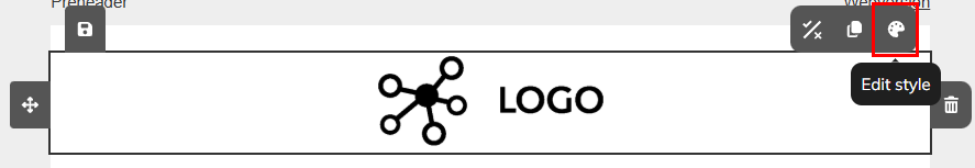
This button will open the style editor on the left of the screen.
From this editor, you will be able to define:
- Row background colors
- Padding
- Border
Row background color
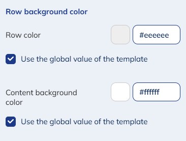
You can edit:
-
The row background color: this is the color of the email background, which appears on each side of the email body. This button only allows modifying the background section directly next to the edited module. To change the color of the whole background all at once, you have to go to the global styles.
-
The content background color: allows you to change the filling color of the block itself.
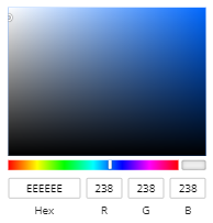
In the color picker, you can choose a color from the palette or by entering a hexadecimal or RGB code. The latest colors used and the template colors are kept in memory.
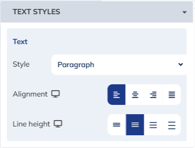
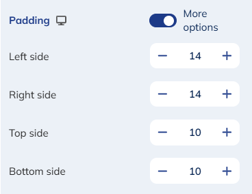
Padding
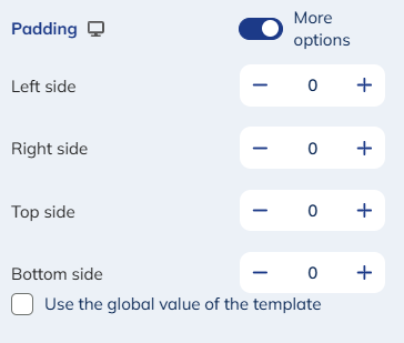
The padding of a block allows you to change the alignment of the content of a block in relation to the background and the other blocks, meaning how centered is the content within the borders of the block.
This is especially visible for images, for instance.
The padding to the left and the right will add a margin of the sides, filled by the "content color". It is often preferred to center the image by defining the same padding on both sides, but they can be defined independently.
The padding to the top and the bottom adds a margin filled by the "content color" between the content of the module and the block above/below.
The max padding is 100 pixels.
Borders
The style editor of a module also allows you to define a border around the block (to frame an image or text for example).
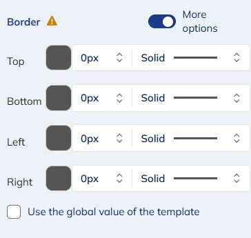
This is what you can modify:
- the border color
- the weight (in pixels)
- the style (simple, dotted, dashes...)
If you would like to further modify a block, you can switch on the "More options" button. You will then be able to define a border style for every single side of the block.
Your changes will be saved when you click on the "Save" button to the bottom right, or if you click in the editor.
The padding and borders options require the block to have been coded specifically. They may be not available on some blocks with a simpler design, or in custom templates made before the release of these features. Please contact your account manager if you want to update your custom design template.
Specific features of dynamic modules
Dynamic modules give you greater flexibility when customizing your emails.
With these modules, you can:
- Edit the module structure by adding the elements you want (Text, Title, Call to action button, Image, Social, Review)
- Define a specific style for the web or mobile version.
- Choose which elements to display depending on the version (web or mobile).
- Easily apply your brand's visual identity to the entire email.
Text & title style
When you add a text or title block in a dynamic module, you will be able to edit its style.
To do so, click on your text.
A specific menu will open in the left tab, allowing you to define:
- Text styles
- Block options
Text styles
From this menu you will be able to define text formatting options for your content and choose the alignment, and spacing that best fit your design.
In this menu you will find parameters options for:
- The text style: Title 1, title 2 or paragraph as they are defined in the "Global style" menu. Please note, that for text style, it is not possible to define 2 different styles for desktop and mobile version
- The alignment: left, center, right or justify
- The line height: compact (1), normal, comfortable (1.5) or spacious (2)
For accessibility reason, we recommend using left alignment.
Block options
This tab of the menu allows you to define a padding for your text and choose whether or not to hide your text for either version.
With the "More options" feature, you have the choice to apply different padding for all sides of your text.
Without this feature enabled, the padding size you define, will be applied to all sides (Left, right, bottom and top).

Button style
When you add a button in a dynamic module, you will be able to edit the style of the button.
Like for the other modules, go to the button style editor.
From this menu, you will be able to define some parameters such as the background color, the texts size, font... like you'll do it for button of standard module.
In addition to these parameters, a series of additional options specific to dynamic modules are available:
- The padding
- The width
- The hover
- And position options
Size
You can choose to keep the size auto or to define a specific size. When you check the option, a specific menu will appear, allowing you to choose the size of the button.

The percentage you choose corresponds to the percentage of the module width occupied by the button.
For multi-columns modules, this percentage corresponds to the percentage of the column width occupied by the button.
Padding
You can choose to define the overall spacing of the button, relative to all sides. This padding is defined in pixels.
If you wish to define a specific padding for each side of the button, please check "More options".
A specific menu will appear, allowing you to define a specific padding for each side of the button.
Hover
You can define hover behavior options for your button and choose whether or not to activate the functionality.
This option allows you to highlight your button when one of your profiles hovers over it with their mouse.
You can define a specific color, font and font style for the hover.
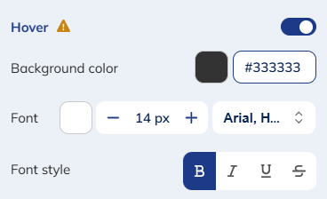
Hover options are not supported in mobile versions, nor are they supported by all e-mail engines, including Outlook. Meaning that profiles on mobile or whose email manager does not support hover designs, will see the standard button when hovering their mouse over it.
Hover over a button in the e-mail editor gives you access to the actions menus available for this button. To see the rendering of the hover options defined, exit the editor menu :
Block options
You can also modify the alignment of your button in the module and choose whether or not to hide it for either version.
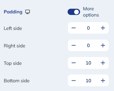
Image style
When you add an image in a dynamic module, you will be able to edit its style.
To do so, click on "Edit image style".
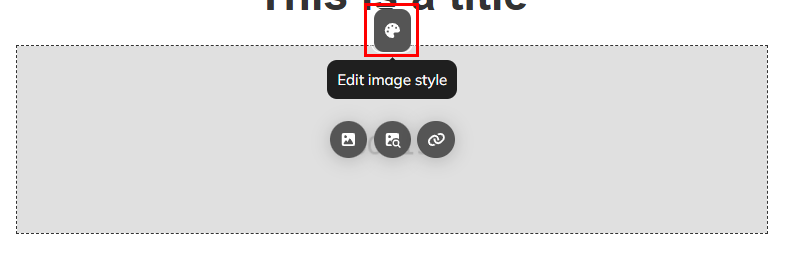
From this menu, you will be able to define some parameters for your picture:
- The size
- The Border
- And block options
Image styles
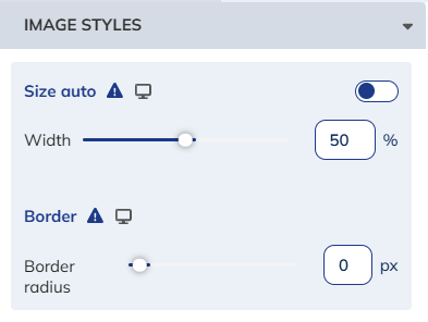
From this tab you will be able to define:
- Size: allows you to keep the size auto or to define a specific size. The chosen percentage you corresponds to the percentage of the module width occupied by the image.
For multi-columns modules, the size percentage corresponds to the percentage of the column width occupied by the image.
- Borders: allows you to define the border radius, which corresponds to the roundness of the corners of the image. If you set it to 0 pixels, the image will have right angles. By increasing this radius, you will round the corners of the image, to get a more or less rounded corners depending on the value.
Please note that Outlook has limited support for border styling in emails. If you apply borders styles (buttons and images) in your campaign design, the message may not appear as intended for your profiles viewing it in Outlook.
Block options
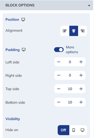
You can also modify the alignment and padding of your image in the module and choose whether or not to hide it for either version.
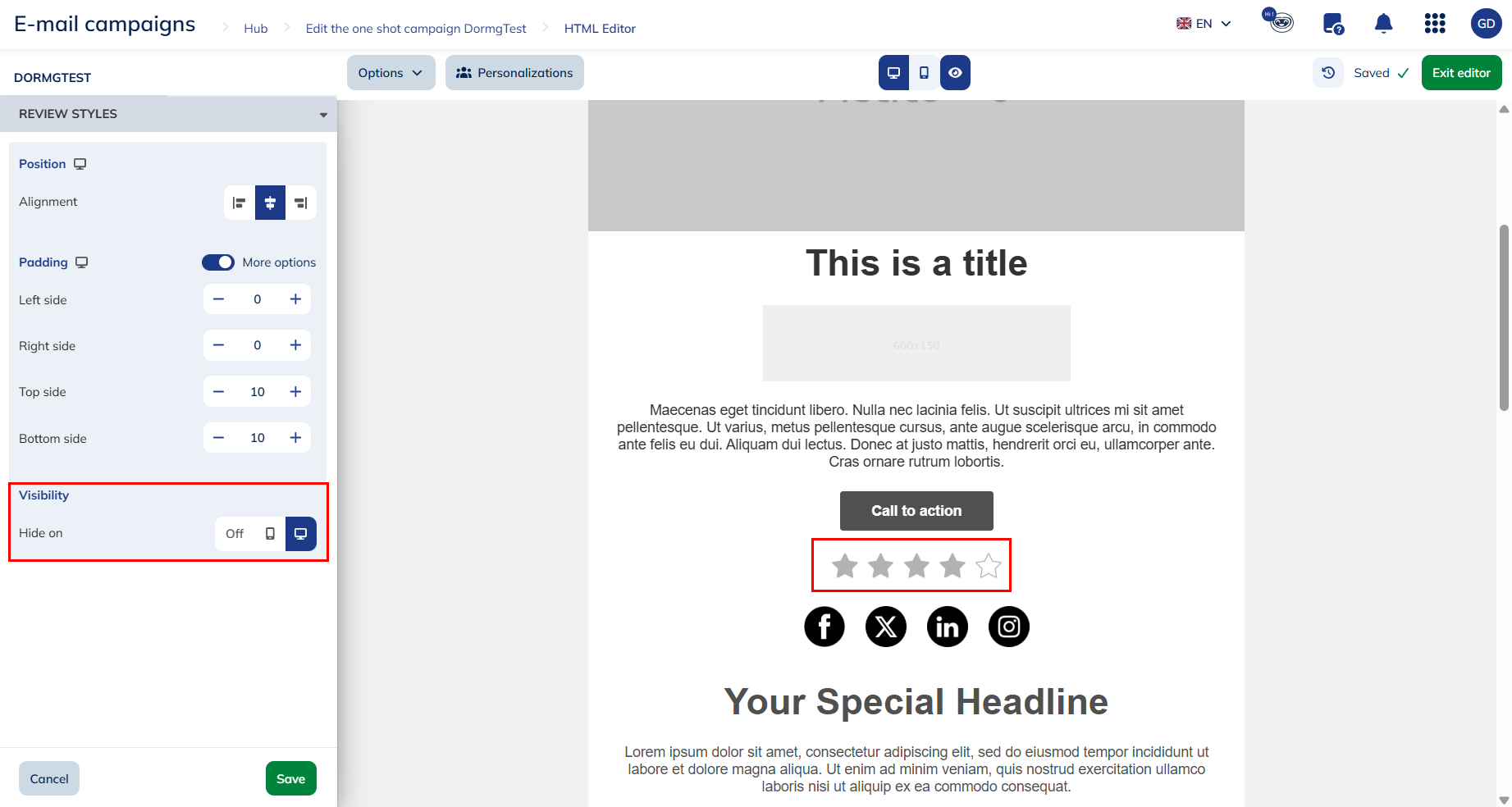
Review & social style
When you add a review or social element in a dynamic module, you will be able to edit its style.
To do so, click on "Edit style" icon.
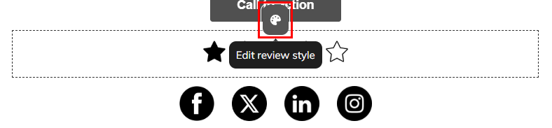
From the menu, you'll be able to define the alignment and padding the elements in the module and choose whether or not to hide it for either version.
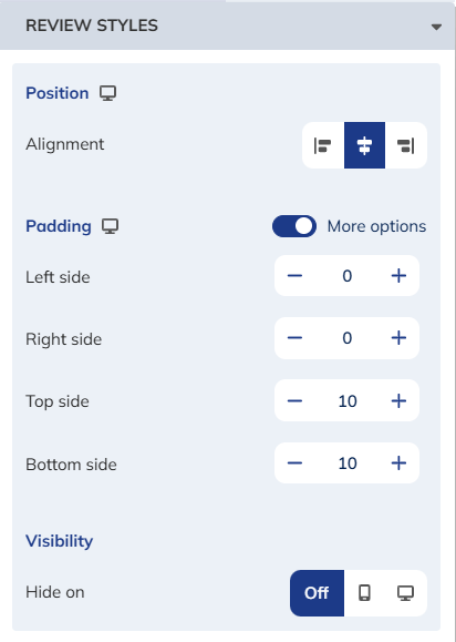
Image + text style
If you're using an image + text module, you can edit its style.
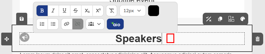
As with text modules, to display the module's specific menu, click anywhere in your text.
From the menu, you can define:
- Text styles
- Block options
Text styles
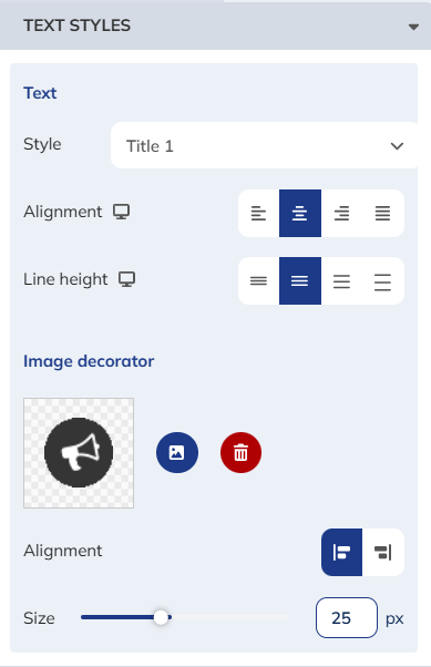
From this tab, you can define:
- Text style: allows you choose a style for your text from those defined in the global styles menu
- Text alignment: left, center, right, or justified
- Line height: compact (1), normal, comfortable (1.5), and spacious (2)
- Decorative image: allows you select an image from your device or via a URL, or remove the image
- Image alignment: right or left
- Image size: in pixels in the module
Block options
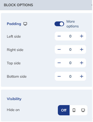
You can also modify the padding of your image and texte zone in the module and choose whether or not to hide them for either version.
Define styles according to the version (mobile or web)
The editor also allows you to apply different style settings depending on whether your email is for the web or mobile version.
You can easily identify the settings for which it is possible to define different styles depending on the version, thanks to the presence of an icon ("computer" for the web version or "mobile" for the mobile version) next to the setting.

To set different options for the mobile version, simply go to the mobile version of the editor and set the options you wish to give it.
A small "Mobile" popup will appear next to each menu, to let you know that the options you have set apply only to the mobile version.

Adapting your design for each device isn't just about style. It's about accessibility and readability. A font size or color contrast that's perfect on desktop might be harder to read on mobile and vice-vers. Defining different style for both version allows you to create an optimal experience on every screen.
If you wish to keep the same design for both, simply click the cross next to "Mobile version" to apply the same style to all devices.
Mobile and Web version for dynamic modules
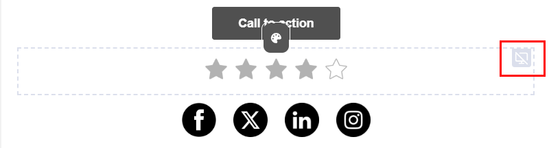
For dynamic modules, you also have the possibility to hide certain elements for the web or mobile version.
If you choose to hide certain elements for either version, you can view the rendering of each version with the buttons hidden by clicking on the "Display hidden elements" option.

You will then see that the hidden elements of the version you are working on are grayed out.
 When you move your mouse over a grayed-out element, a blue frame appears to indicate the version for which the button is hidden.
If you wish to see the final rendering of your versions, without the hidden elements, simply click on the "Do not display hidden elements" option.

Outlook limitations
Outlook is the prime corporate mailbox. While it is less present in a B2C context, compatibility with Oultook remains a major stake (and challenge) in the design of your emails.
In the market, Outlook is the mailbox with the least compatibility with the modern features of the emailing world. Indeed, the engine of this mailbox is based on another well-known Microsoft texte processor software: Word.
This entails constraints and limitations on what can be done with the different style modifications (without them being linked to the Actito editor, but to the features compatible with Outlook).
Fonts
All the available fonts are so-called "web safe" fonts, which means they are pre-installed on all operating systems. The so-called "google fonts" offer more possibilities but way less compatibility, to the point that they always require a fallback font. They are not available by default in the editor but only on demand in custom templates.
Buttons
If a button is left without a link, Outlook will break the display, as if the text was sticking to the edges.
Borders radius (round corners) are not always applied.
Buttons with two lines of text may display a "double button" (the height of the button is doubled).
Borders/Padding
The display of the bottom and right borders may cause display issues: no display for a border of 1 pixel, display reduced in half (1 pixel) for a border of 2 pixels, etc.
This is also the case for button borders.